Apple’s New MacBook Neo Colors Disappoint
Apple's new MacBook Neo arrives with a range of 'fun' colors, but reviewers find them surprisingly pale and underwhelming. The muted palette contrasts sharply with the vibrant hues popular on iPhones, sparking debate about Apple's color strategy for its Mac and iPad lines.
Apple’s New MacBook Neo Colors Fail to Dazzle
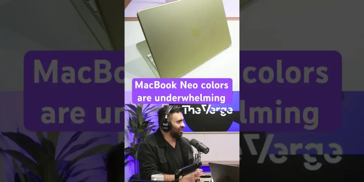
Apple’s latest MacBook Neo has arrived, and while the device itself promises the usual blend of power and portability, its new color options have left many, including ourselves, feeling decidedly underwhelmed. The much-touted ‘fun colors’ that were expected to inject a fresh dose of personality into the MacBook lineup have turned out to be surprisingly muted, leading to questions about Apple’s strategy for color on its Mac and iPad devices.
A Palette of Pale Hues
The core of the disappointment lies in the execution of the color palette. Instead of the bold, vibrant hues that have proven incredibly popular on Apple’s iPhone lineup, the MacBook Neo opts for a series of pale shades. The yellow, described as ‘citrus,’ is particularly notable for its washed-out appearance, with one reviewer likening it to a ‘pale yellow that looks a wee, let’s call it stained.’ This stark contrast to the enthusiastic reception of colors like the iPhone 16’s blue and the iPhone 17 Pro’s orange highlights a puzzling inconsistency in Apple’s design philosophy.
Why the Hesitation on Color?
It’s a question that has been on the minds of many Apple enthusiasts: why does the company, so adept at leveraging color to drive desirability in its iPhone range, shy away from similar boldness in its Mac and iPad products? The success of vibrant color options on iPhones is undeniable. Consumers have consistently gravitated towards these more expressive choices, yet Apple seems hesitant to fully commit to this strategy across its entire ecosystem. The MacBook Neo’s pale colors feel like a missed opportunity to capture that same consumer enthusiasm.
While some in the online community have expressed appreciation for the mere existence of color options, the consensus among those who have seen the devices in person, or who have followed the reviews closely, is that the execution falls short. The potential for these machines to be as visually exciting as their mobile counterparts is present, but Apple’s conservative approach to color on these larger form factors prevents it from being fully realized.
Who Should Care About This?
For the average consumer looking for a reliable laptop, the color of their MacBook Neo might be a secondary concern. However, for those who value aesthetics and see their technology as an extension of their personal style, this is a significant point of consideration. The decision to buy a laptop is often influenced by more than just raw specifications; the emotional connection to a device, its look and feel, plays a crucial role. The current color offerings for the MacBook Neo may not foster that same level of excitement or personal connection for a segment of Apple’s most design-conscious audience.
Furthermore, this discussion is relevant to anyone invested in Apple’s broader design language. The inconsistency raises questions about Apple’s future product releases and whether we can expect more vibrant color options on future Macs and iPads, or if the company will continue to reserve its most adventurous color choices for the iPhone.
Looking Ahead
While the MacBook Neo’s subdued color palette may not be a deal-breaker for everyone, it represents a curious choice from a company that has consistently pushed boundaries in product design. The hope remains that Apple will reconsider its approach and bring the same level of color confidence to its Mac and iPad lines that it so successfully employs with its iPhones. Until then, users seeking a more vibrant computing experience may need to look elsewhere or settle for the more muted, albeit still premium, offerings from Apple.
Specs & Key Features
- Product: MacBook Neo
- New Color Options: Described as ‘pale’ and ‘muted’
- Comparison: Contrast with vibrant iPhone colors (e.g., iPhone 16 blue, iPhone 17 Pro orange)
- Criticism: Colors perceived as washed-out, lacking boldness
- Target Audience: Design-conscious consumers, Apple ecosystem users
Source: The MacBook Neo colors underwhelmed us. What do you think? #Vergecast (YouTube)
Related Articles


M5 Pro/Max MacBook Pros Arrive with Price Hike
Apple's new MacBook Pro models arrive with the powerful M5 Pro and M5 Max chips, promising significant performance gains. While the design remains familiar, expect increased storage and a higher starting price point.

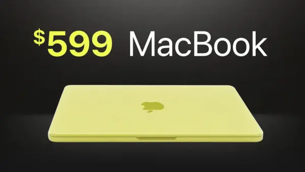
Apple’s MacBook Neo Stuns With $599 Price Tag
Apple enters the budget laptop market with the groundbreaking MacBook Neo, priced at $599. Featuring an aluminum build and the A18 Pro chip, it aims to disrupt the industry while strategically omitting key features to maintain product hierarchy.


iPhone 17e: Apple’s Budget King Gets a Storage & MagSafe Boost
Apple's iPhone 17e arrives with a significant value proposition, doubling base storage to 256GB and reintroducing MagSafe, all while maintaining its $600 price point. Powered by the A19 chip, it offers a compelling entry into the Apple ecosystem.